- What is Python Seaborn?
- Types of Plots we can construct with Seaborn
- Working with Multiple plots
- Some alternatives for Python Seaborn
This looks like a lot to cover. Let us get started now.
What is Python Seaborn library?
Seaborn library is a Python package which allows us to make infographics based on statistical data. As it is made on top of matplotlib, so, it is inherently compatible with it. Additionally, it supports NumPy and Pandas data structure so that plotting can be done directly from those collections.
Visualising complex data is one of the most important thing Seaborn takes care of. If we were to compare Matplotlib to Seaborn, Seaborn is able to make those things easy which are hard to achieve with Matplotlib. However, it is important to note that Seaborn is not an alternative to Matplotlib but a complement of it. Throughout this lesson, we will make use of Matplotlib functions in the code snippets as well. You will select to work with Seaborn in the following use-cases:
- You have statistical time series data to be plotted with representation of uncertainty around the estimates
- To visually establish the difference between two subsets of data
- To visualise the univariate and bivariate distributions
- Adding much more visual affection to the matplotlib plots with many built-in themes
- To fit and visualise machine learning models through linear regression with independent and dependent variables
Just a note before starting is that we use a virtual environment for this lesson which we made with the following command:
source seaborn/bin/activate
Once the virtual environment is active, we can install Seaborn library within the virtual env so that examples we create next can be executed:
You can use Anaconda as well to run these examples which is easier. If you want to install it on your machine, look at the lesson which describes “How to Install Anaconda Python on Ubuntu 18.04 LTS” and share your feedback. Now, let us move forward to various types of plots which can be constructed with Python Seaborn.
Using Pokemon Dataset
To keep this lesson hands-on, We will use Pokemon dataset which can be downloaded from Kaggle. To import this dataset into our program, we will be using the Pandas library. Here are all the imports we perform in our program:
from matplotlib import pyplot as plt
import seaborn as sns
Now, we can import the dataset into our program and show some of the sample data with Pandas as:
df.head()
Note that to run the above code snippet, the CSV dataset should be present in the same directory as the program itself. Once we run the above code snippet, we will see the following output (in Anaconda Jupyter’s notebook):

Plotting Linear Regression curve
One of the best thing about Seaborn is the intelligent plotting functions it provides which not only visualises the dataset we provide to it but also construct regression models around it. For example, it is possible to construct a linear regression plot with a single line of code. Here is how to do this:
Once we run the above code snippet, we will see the following output:
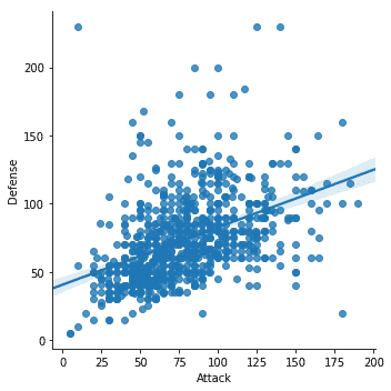
We noticed few important things in the above code snippet:
- There is dedicated plotting function available in Seaborn
- We used Seaborn’s fitting and plotting function which provided us with a linear regression line which it modelled itself
Don’t be afraid if you thought we cannot have a plot without that regression line. We can ! Let’s try a new code snippet now, similar to the last one:
This time, we will not see the regression line in our plot:

Now this is much more clear (if we do not need the linear regression line). But this isn’t just over yet. Seaborn allows us to make different this plot and that is what we will be doing.
Constructing Box Plots
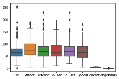
One of the greatest feature in Seaborn is how it readily accepts Pandas Dataframes structure to plot data. We can simply pass a Dataframe to the Seaborn library so that it can construct a boxplot out of it:
Once we run the above code snippet, we will see the following output:
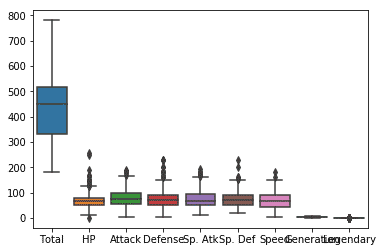
We can remove the first reading of total as that looks a little awkward when we are actually plotting individual columns here:
# New boxplot using stats_df
sns.boxplot(data=stats_df)
Once we run the above code snippet, we will see the following output:
Swarm Plot with Seaborn
We can construct an intuitive design Swarm plot with Seaborn. We will again be using the dataframe from Pandas which we loaded earlier but this time, we will be calling Matplotlib’s show function to show the plot we made. Here is the code snippet:
sns.swarmplot(x="Attack", y="Defense", data=df)
plt.show()
Once we run the above code snippet, we will see the following output:
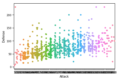
By using a Seaborn context, we allow Seaborn to add a personal touch and fluid design for the plot. It is possible to customise this plot even further with custom font size used for labels in the plot to make the reading easier. To do this, we will be passing more parameters to the set_context function which performs just like what they sound. For example, to modify the font size of the labels, we will make use of font.size parameter. Here is the code snippet to do the modification:
sns.swarmplot(x="Attack", y="Defense", data=df)
plt.show()
Once we run the above code snippet, we will see the following output:
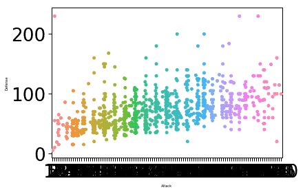
The font size for the label was changed based on the parameters we provided and value associated to the font.size parameter. One thing Seaborn is expert at is to make the plot very intuitive for practical usage and this means that Seaborn is not just a practice Python package but actually something we can use in our production deployments.
Adding a Title to plots
It is easy to add titles to our plots. We just need to follow a simple procedure of using the Axes-level functions where we will call the set_title() function like we show in the code snippet here:
my_plot = sns.swarmplot(x="Attack", y="Defense", data=df)
my_plot.set_title("LH Swarm Plot")
plt.show()
Once we run the above code snippet, we will see the following output:
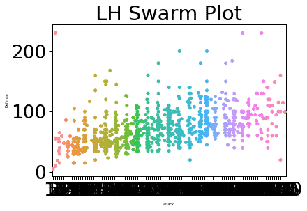
This way, we can add much more information to our plots.
Seaborn vs Matplotlib
As we looked at the examples in this lesson, we can identify that Matplotlib and Seaborn cannot be directly compared but they can be seen as complementing each other. One of the features which takes Seaborn 1 step ahead is the way Seaborn can visualise data statistically.
To make best of Seaborn parameters, we highly recommend to look at the Seaborn documentation and find out what parameters to use to make your plot as close to business needs as possible.
Conclusion
In this lesson, we looked at various aspects of this data visualisation library which we can use with Python to generate beautiful and intuitive graphs which can visualise data in a form which business wants from a platform. The Seaborm is one of the most important visualisation library when it comes to data engineering and presenting data in most visual forms, definitely a skill we need to have under our belt as it allows us to build linear regression models.
Please share your feedback on the lesson on Twitter with @sbmaggarwal and @LinuxHint.
